What survives restaging — and what doesn't
This is the page we'd want to read first. Staging a product into new scenes is genuinely useful — in our discovery test, 15 of 20 product cases came back usable and none broke outright — and it is not magic. Bold branding carries; fine lettering is fragile. Here's the honest map, with a real failed example.
What preserves well
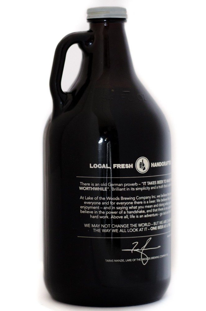
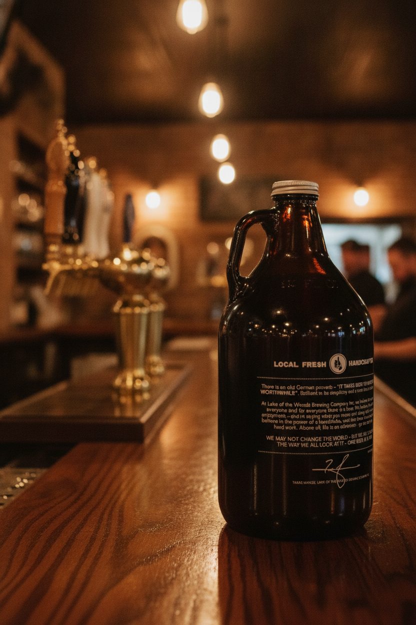
Prominent branding is the most reliable thing of all. Across our discovery test, large readable product names and logos survived scene placement cleanly on every product that had them — the growler's "LOCAL FRESH" mark above still reads, and in the wider test bottles, tubes, cans, bags and decorated ceramics all kept their brand, color and general form.
Solid colors and materials carry faithfully too: amber glass stays amber, a matte tube stays matte. For the everyday job — showing a product on a shelf, a counter, in a room — this is exactly enough, and it's why the tool is genuinely useful rather than a novelty.
What softens or fails
Fine print is the weak point, full stop. In the example above, the growler's shape and cap are preserved and its big branding survives, but the dense paragraph of small body text and the signature re-rendered as illegible texture. That was the single most common miss in our test: paragraph body copy, ingredient and nutrition panels, legal type, batch codes and signatures do not survive restaging. Big branding holds; small print doesn't.
There's a second, subtler limit: silhouette can drift on design-defined products. On our test a faceted luxury perfume bottle came back slightly slimmer with a restyled stopper — fine for some everyday goods, but a real risk if the precise shape is the brand. And a reference shot from the back or of a nutrition panel can lead the tool to invent a plausible front, so start from the face you actually want shown.
How to work with the limit, not against it
- Keep fine-print faces away from the camera, or crop tighter so any small text you do show is large enough to survive.
- Use scenes for hero and context angles where the product reads clearly; keep a separate, real close-up for detail-critical panels.
- Check the fine print and shape in every generated frame before you publish — never assume they carried.
- For anything where the small text is the point (dosage, ingredients, compliance copy), or where a precise silhouette is the brand, treat a real photo as non-negotiable.
- Start from a clean, well-lit hero shot — the tool can't recover detail the photo never showed.
Don't rely on it for detail-critical text
If a shopper needs to read the ingredient list, dosage, or legal copy from the image, use a real close-up photo. A staged scene is for context, not for reproducing fine text you're accountable for.
The rule of thumb
- Prominent branding, solid colors and materials preserve reliably; fine print is fragile and a precise silhouette can drift on design-defined products.
- A softened label or a warped signature shape is a failed result, never an acceptable variation — re-run it or reshoot.
- Verify the small text and shape in every frame; keep real close-ups for anything you're legally accountable for.
Questions, answered plainly
Why can't it just keep the fine print perfectly?
Restaging rebuilds the product into a new scene and lighting, and the tiniest, lowest-contrast details carry the least information to preserve — so they're the first to soften, particularly at smaller sizes. Bold branding and large text hold; micro-type is fragile. That's a real limit, not a setting you can switch off.
So when should I just reshoot?
Whenever the small text or fine artwork is the point of the image — ingredient panels, dosage, certifications, compliance copy. For those, a real close-up is the honest and reliable choice. Use staged scenes for the hero and lifestyle angles where the product reads clearly.
How do I know if a result is good enough?
Put the generated frame next to your reference and check the label, the shape and the color. If a detail drifted or the print blurred, discard it — the whole point is that the image still shows your real product.